Revitalizing the VoiceComm Brand
Cover image from the new VoiceComm Brand Guide
Identifying the Parameters
Upon joining VoiceComm in 2022, I encountered a brand facing an identity challenge. The existing brand lacked cohesion, struggling to harmonize with its various partner brands without causing visual discord or being itself lost in the mix. Moreover, its own identity had grown a bit stale over time. Some of its key recognizable elements had become dated, necessitating a contemporary touch.
My given objective was to orchestrate a subtle brand "refresh" that could seamlessly unfold without causing confusion or alarm among existing customers. The goal was to implement changes so seamlessly integrated that they wouldn't immediately register as a rebrand, yet would significantly elevate the brand's recognizability and perceived professionalism. To that end, I was directed to preserve the brand's current logo, colors, and font during this transformation.
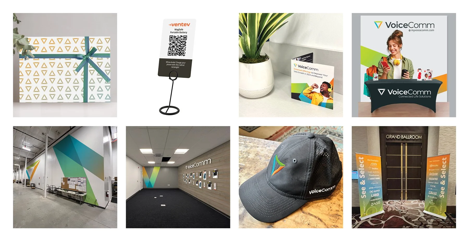
Examples of the old VC Brand in action.
Analyzing the Current Branding with Identified Core Needs
Delving into the existing branding landscape at VoiceComm, I conducted a thorough analysis to dissect its strengths and weaknesses. This involved a meticulous examination of the brand's visual elements, messaging strategies, and overall design coherence. In my in-depth analysis of VoiceComm's current branding, I strategically identified three core needs that became the guiding pillars for the brand refresh:
Establishing a Harmonious Representation: The challenge was to find a method to faithfully represent the diverse array of brands distributed by VoiceComm while ensuring that VoiceComm itself retained a distinctive visual identity. This involved navigating the delicate balance of unity and individuality in the overall brand representation.
Elevating with a Modern Theme: To elevate and modernize the branding, I sought a thematic connection with logistics and technology. The goal was to infuse the brand with a contemporary flair that not only aligned with industry trends but also reinforced VoiceComm's position at the forefront of technological advancements in its field.
Maximizing the Trichromatic Palette: Leveraging VoiceComm's vibrant trichromatic brand, characterized by bright and dynamic colors, was crucial. The challenge was to utilize this bold palette in a way that exuded professionalism and crispness. This involved a meticulous exploration of color application to ensure that the brand's visual impact remained both vivid and refined.
These core needs served as the foundation for the subsequent stages of the brand refresh, guiding the strategic decisions made to enhance and revitalize VoiceComm's visual identity. Below are a selection of pages from VoiceComm’s new Brand Guide and a little bit of the new strategy they outline.
Core elements of style.
Creating Recognizable Text Treatments
To ensure consistent recognition, I developed distinct typographic stylings that catered to diverse content across VoiceComm's branding. By carefully crafting multiple defined styles for type, each tailored to specific communication needs, I maintained a cohesive yet versatile approach. This strategy allowed for uniformity in messaging while accommodating various contexts, ultimately contributing to a visually harmonious and recognizable text treatment throughout the brand.
Implementing Subtle Greyscale Treatments for a Modern Metallic Look
In pursuit of a clean, high-tech modernity, I strategically incorporated subtle greyscale treatments into the branding. This technique resulted in a soft metallic aesthetic that not only exuded a contemporary vibe but also seamlessly harmonized with any partner brand. The adaptability of this greyscale approach allowed for the integration of VoiceComm's vibrant colors when needed, yet provided the flexibility to focus on partner brands by toning down or omitting the primary colors. This thoughtful balance ensured that, while VoiceComm maintained its essence, the visual focus could dynamically shift to spotlight the uniqueness of each partner brand.
Creating the Glass and Metal Icon Styles
In response to the challenges presented by the eclectic categories on the VoiceComm website, I crafted the Glass Icons as a visually distinctive yet non-specific representation. Modern design trends in web development inspired this style, where Glass Shapes seamlessly integrated brand colors, transparency concepts, and a flat geometric approach. Drawing from new and remediated brand elements like the ribbon of connectivity and gradient overlay photography, the Glass Icons maintained a harmonious extension of the VoiceComm Brand. Their adaptability allowed for nuanced representation without risking misrepresentation of our valued partners.
For more direct illustrative needs, particularly in product categories and website wayfinding elements, I introduced the Metal Icons. These icons, resembling traditional line art but infused with boxy minimalism, directly reference VoiceComm's new focus on greyscale minimalism and angular design. The Metal Icon set strikes a balance between decorative and abstract, aligning with the brand's essence while providing a clear and representative visual language for specific use cases on the website and beyond.
Key assets and media.
The Ribbon of Connectivity
I developed this recurring thematic element in VoiceComm's design language lovingly dubbed “The Ribbon of Connectivity” by the marketing team. It serves as a powerful metaphor for the company's distinguished excellence in distribution and service. Using the brand’s vibrant colors, this ribbon symbolizes the connection between people and products, embodying a spirit of joyful optimism and cutting-edge technology. Evoking a ribbon of light, it exudes an airy, clean, and vibrant aesthetic, carefully avoiding a cartoonish appearance. The ribbon gracefully interacts with both people and products, crossing in front of and behind them, creating a dynamic visual impact. Primarily intended as an accent in hero graphics and headers, it occasionally appears around corners and edges, injecting the VoiceComm brand into designs that might otherwise lean towards minimalism, ensuring a sense of continuity and brand presence throughout the visual narrative.
Guidelines for Gradient Photography
I noticed a use of gradient overlaid photography in past designs, and strategically highlighted and refined this approach to exemplify the brand's vibrant colors while avoiding overly garish and cartoonish applications. The adjustment aimed to transform the previously sporadic application into a consistent and sophisticated element. To that end I created a set of guidelines for prepping photos by adjusting saturation and contrast , as well as pre constructed color gradient images so we could achieve just the right effect every time.
Defining Rules for Media Usage
In crafting guidelines for the use of partner-provided media and stock photography, I aimed to ensure that promotional materials align seamlessly with VoiceComm's brand identity. Given that VoiceComm handles materials from various companies, the impact on brand perception is crucial. While ideal images may not always be available, the selection process prioritizes those that work cohesively with VoiceComm's brand. Emphasizing a light and airy aesthetic with soft focus, high definition, and light colors, the chosen photographs should evoke a positive and professional mood. Modern, latest-generation technology is preferred in product shots, fostering a contemporary appeal. Additionally, the humanization of lifestyle photography is encouraged, depicting people interacting with products and each other in upbeat and diverse scenarios. This careful curation reflects VoiceComm's commitment to a positive and inclusive brand narrative.
Rules of engagement for compositions.
Light and Dark Mode Compositions
The new Light & Dark Mode concept introduced in VoiceComm's design language is a strategic framework designed to showcase brand partners in an optimal setting. Compositions predominantly feature crisp greyscales evoking modernism, ensuring recognition without conflicting with partner brands' colors and styles. In Light Mode, the Pale Grey backdrop serves as a neutral canvas (#F3F3F3), enhancing readability and spotlighting partner brands and products. Dark Grey text (#353F42) adds a touch of softness for a sleek and professional appearance in headlines and body text. On the other hand, Dark Mode provides high contrast against lifestyle photos, brand colors, and Light Mode compositions, making headlines and title text stand out. Headers can leverage any of the three primary brand colors for maximum impact, although Dark Mode sacrifices some readability for body text and is best suited for designs with concise textual elements. This versatile Light & Dark Mode duo allows for independent or combined use within a single composition, providing flexibility and visual dynamism in VoiceComm's design landscape, and a fun reference to VoiceComm’s bread and butter, mobile technology.
Angular Geometry
Angular compositions bring a subtle yet dynamic energy to our visual storytelling. By playing with dramatic angles and geometric designs, this approach adds a touch of excitement to our clean and minimalistic designs, drawing inspiration from the flowing Ribbon of Connectivity concept. It's a thoughtful touch that ensures our brand remains easily recognizable, even in situations where our usual vibrant colors take a step back. It was my way of subtly infusing a modern and forward-looking vibe into our visual identity, creating a statement that's both understated and impactful.


Below the new design style transcends static visuals, translating seamlessly into dynamic motion media, all while maintaining the unmistakable VoiceComm identity.
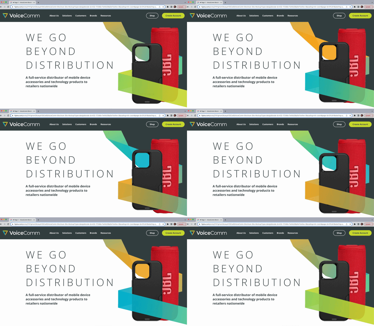
And here you can see a concept draft of the design scheme applied to the in progress website redesign.
The VoiceComm brand refresh has been met with positive acclaim, particularly from company leadership who were thrilled with the subtle yet impactful transformations. The marketing, product, and sales teams are making good use of a slew of new templated and prefab designs while the brand continues to grow with targeted bespoke content.


